A book is more than just words on a page; it’s an experience that combines storytelling with visual appeal. A successful book layout design is the process of arranging the content of a book including text, images, and other elements. The design involves careful consideration of factors such as readability, the visual appeal, the functionality, the mistake to avoid on a book.
How a Good Layout Reinforce The Readability
Key elements such as proper font selection, consistent line spacing, and appropriate margins help guide the reader’s eyes comfortably across the page. Clear headings, balanced white space, and effective text alignment ensure that content is easily digestible, reducing visual strain. Overall, a thoughtfully crafted layout enhances the reading experience, making it enjoyable and accessible for diverse audiences.
Key Elements of Book Layout Design
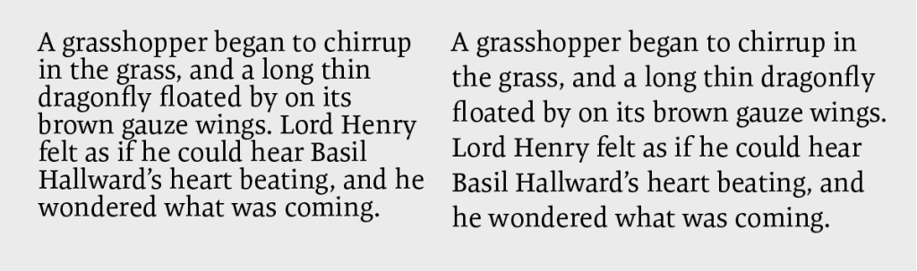
Font Selection and Typography Rules
Font selection and typography are critical to a book’s readability and overall aesthetic. Choosing the right font ensures that text is easy to read and aligns with the tone of the content. The typography rules include maintaining consistent font sizes, line spacing, and alignment throughout the book. Proper use of bold, italics, and capitalization can emphasize important information without overwhelming the reader.
Alignment and Hierarchy in Text
Alignment and hierarchy in text are essential for creating a clear layout. Proper alignment, whether left, right, centered, or justified, ensures consistency and guides the reader’s eye smoothly across the page. A well-defined hierarchy allows readers to quickly navigate the material and understand the flow of information. Both of them together, enhance the readability and providing a visually balanced reading experience.
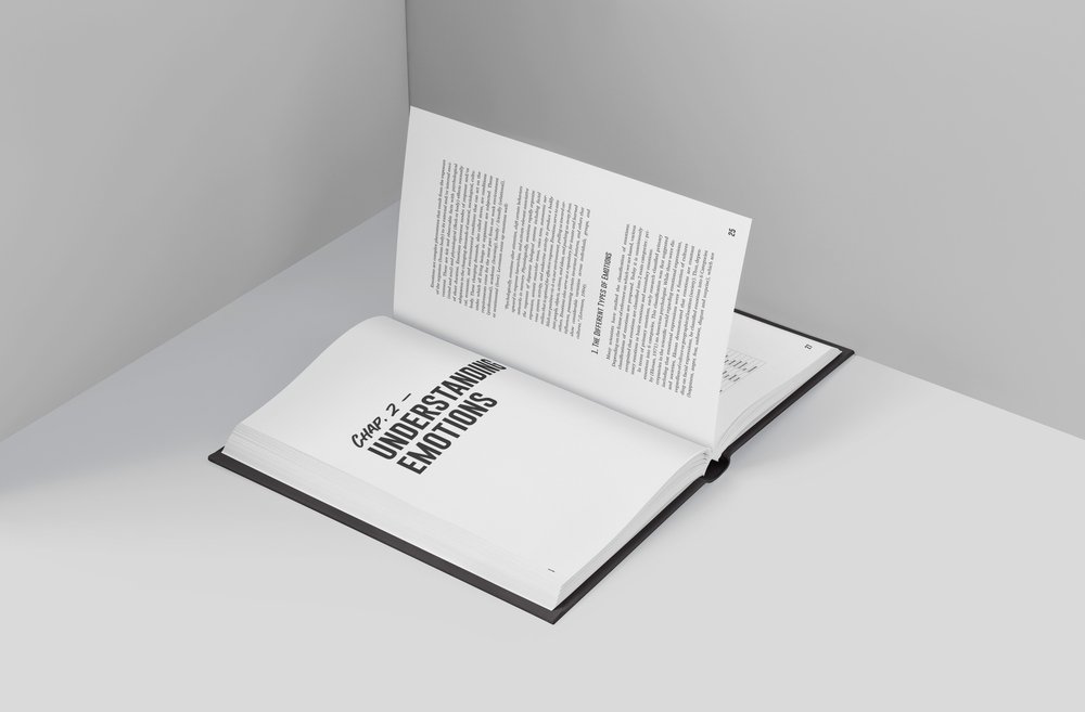
White Space in Book Layout Design
The White Space Matters
Why the white space matter? A good white space between lines and paragraphs makes text easier to read and follow. It prevents the reader’s eye from getting overwhelmed by a dense block of text. White space can help organize information into distinct sections or chapters, making it easier for readers to navigate the content.
Modern Book Layout Design
Minimalist Layouts
A minimalist resume design focuses on simplicity, clarity, and clean lines. It prioritizes readability and allows your skills and experience to take center stage.
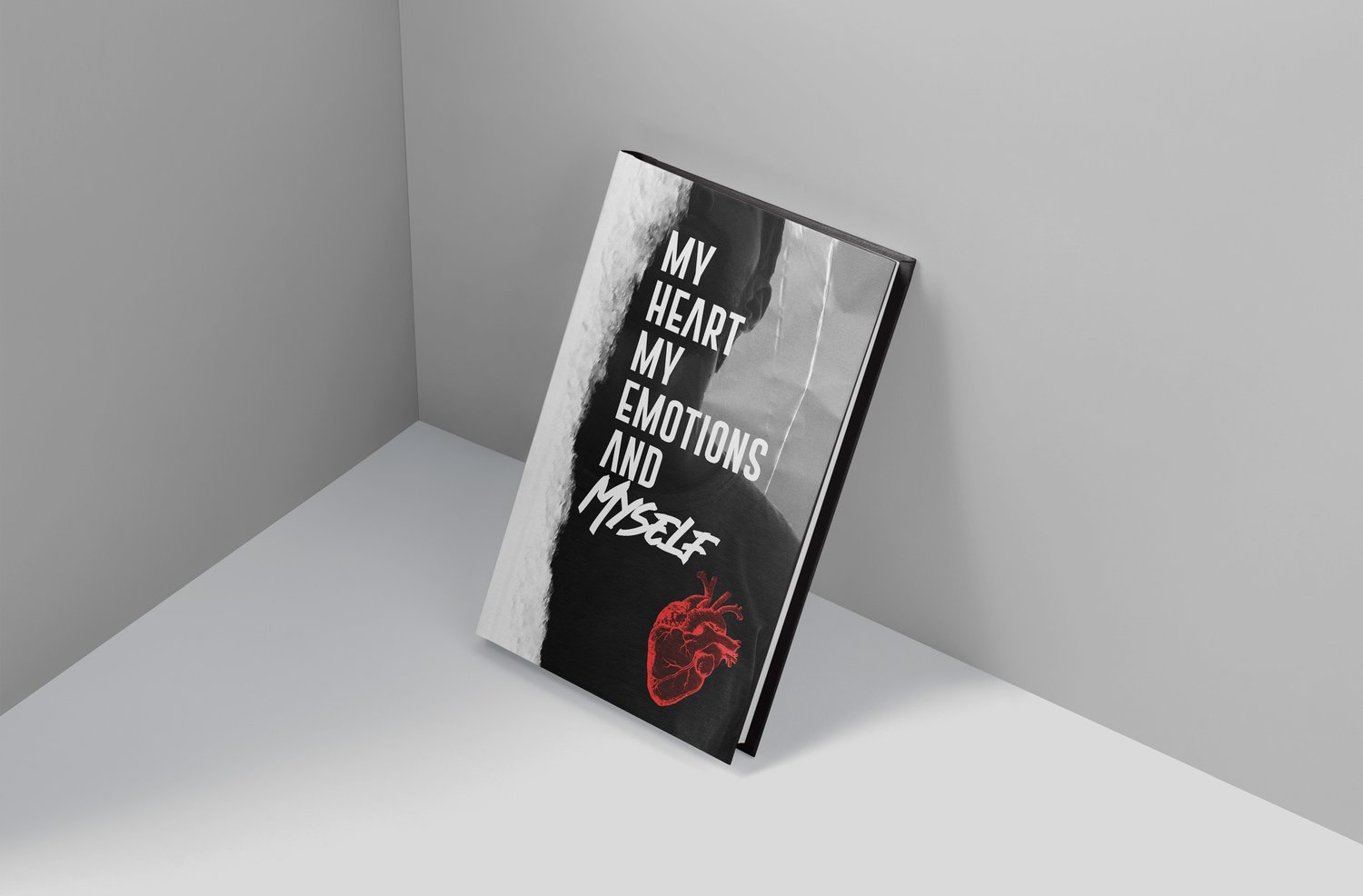
Use of Color and Images in Contemporary Book Design
Color and images are essentiel elements for your book design. They will emprove the overall aesthetic appeal and marketability of a perfect book.
Usual Book Layout Mistakes to Avoid
Poor Font Choices Affecting Readability
A poorly chosen font can hinder comprehension and create a negative impression. Consider the type sizes, letter, and line spacing. Some people will experience crowding, the inability to read well because of the nearby visual clutter of letters, or words that are too close together.
Focusing on The Reader’s
In the end, the goal of book layout design is to create a perfect reading experience. By carefully balancing form and function, designers can produce books that are both visually engaging and easy to navigate. A well-designed book can transport readers to new worlds, evoke powerful emotions, and leave a lasting impression and we are here for that!